This case study explores the journey of transitioning from paper-based methods and phone enrollments to a more efficient, digital-first approach.


Challenge
The Problem
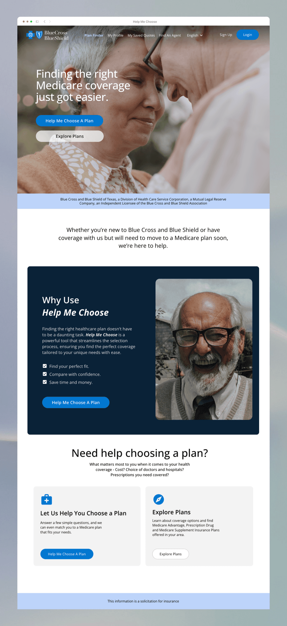
The business needs to improve their online healthcare plan selection tool to reduce phone calls and paper enrollments, as the current tool is challenging for less tech-savvy members.

Objective
Our Goal
Redesign the healthcare plan selection tool to have a user-friendly interface that is easy for people with different tech skills to use.

Results
Our Findings
20% Increase in user satisfaction


Users struggled to create accounts required for accessing services
Users had trouble finding key information, leading to confusion and poor experience.
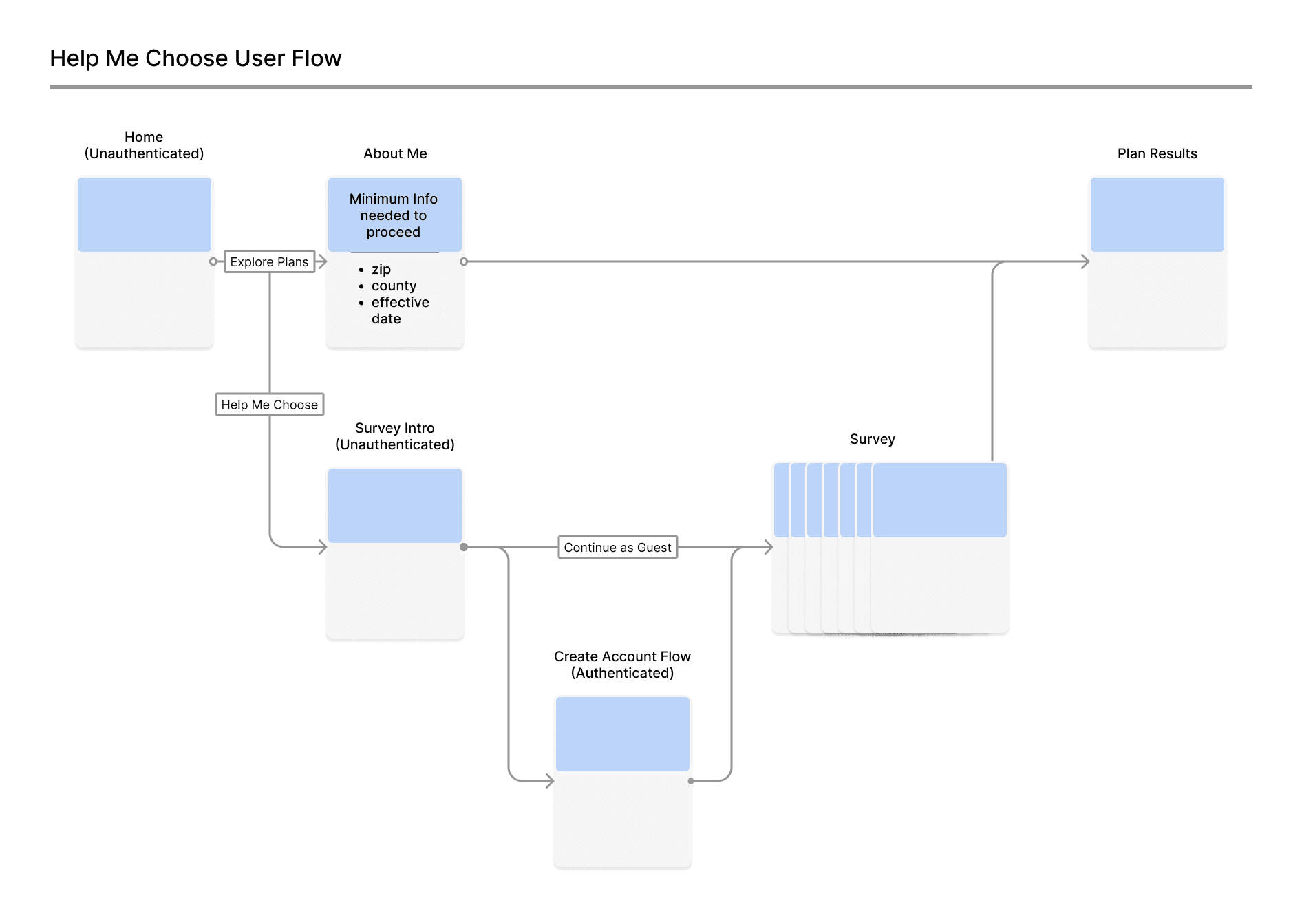
User Flow
Guest Account
The guest account allowed visitors to bypass account creation and explore our plans immediately if they prefered to browse first.
Guest Account Key Benefits:
Streamlined Checkout
Increased Conversions
Enabled easy account setup post-purchase.
Provided a frictionless path to plan viewing.

While guest access facilitated hassle-free browsing, we also recognized the value of creating an account for an enhanced user experience.
Account Creation Benefits:
Save Plans for Easy Retrieval
Store Prescription History
Link to Primary Care Provider
Integrate Preferred Pharmacy
Secure, Personalized Health Profile

The Fiber Design System is the foundation for creating cohesive and accessible user experiences across our products. It's a living system, constantly evolving and expanding to meet our users' needs.
This case study showcases the basic building blocks that make up the system, laying the groundwork for more complex components.

Users First: From the initial research to the final testing, we kept users' needs and preferences front and center. Every decision was driven by user feedback.
Innovative Thinking: The member and guest account options, along with the optional survey for personalized results, show our commitment to innovation and meeting diverse user needs.
Lessons
Learned
Iterate, Iterate, Iterate: The iterative approach to design and testing, especially during development and delivery, was key to refining the tool and ensuring it's relevant and usable.
Visuals Matter: The redesigned screens and flow charts effectively communicated changes and helped stakeholders and the team stay on the same page.