This case study explores our transformation of a legacy system into a more efficient platform, focusing on reducing task time and minimizing user errors. Using the Double Diamond Model, we investigated the needs of our users and addressed functionality gaps, with particular emphasis on redesigning the FAQ section. Our approach successfully tackled usability challenges, significantly enhancing overall user interaction and streamlining access to critical information.


Challenge
The Problem
The tool was undergoing an overhaul due to outdated information and poor navigation, causing user frustration in locating items.

Objective
Our Goal
Integrate an intuitive FAQ section to streamline navigation and reduce task completion time and errors.

Results
Our Findings
Achieved a 40% reduction in task time


Challenges
and Vision
After updating the Internal Tool, users struggled to understand new features and functionality. To address this, we decided to create an FAQ section and a help center, designed to be easily expandable. Our vision is to develop a comprehensive, scalable knowledge base that can accommodate future features, including AI-enhanced support.
Ideation
Help Center
Stakeholder's Vision
Initially, the help center will feature FAQs. Subsequent sprints will introduce additional elements, including an AI chatbot, support features, and more.

Ideation
Icons
Stakeholder's Vision
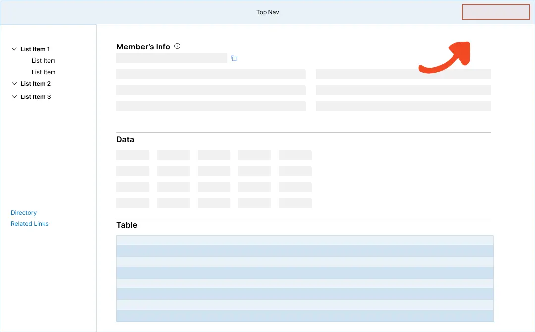
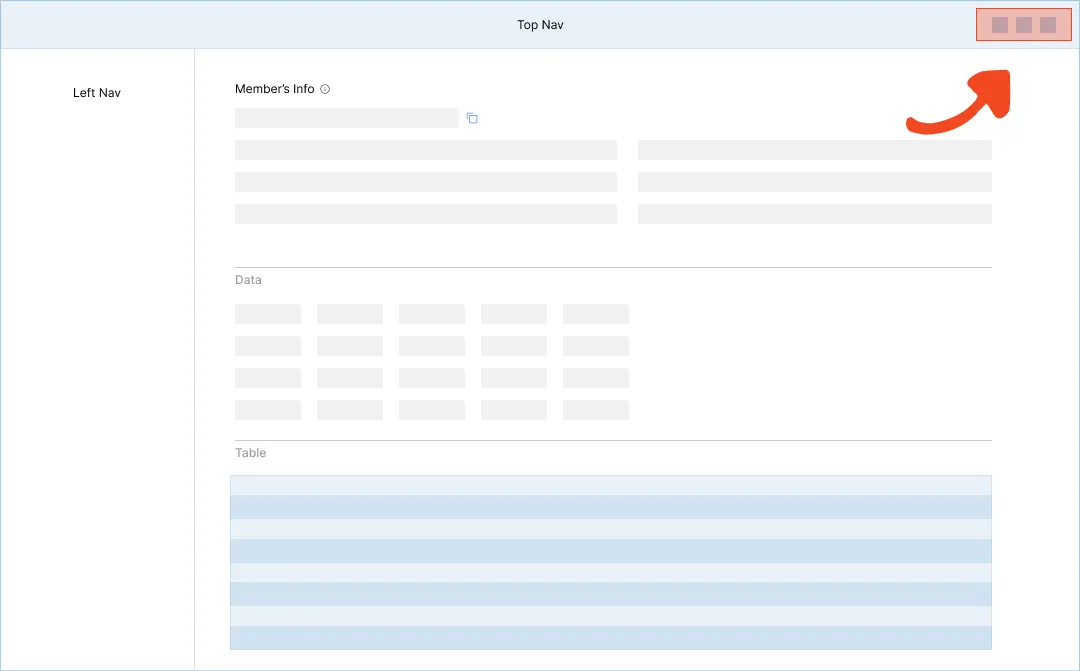
To enhance navigation clarity, we introduced new icons for key functions. Specifically, we added visual cues for the Application Switcher, Help Center, and Sign Out actions. These icons aim to improve user orientation and streamline access to essential features within the interface.
Iteration 1
Lo-Fi
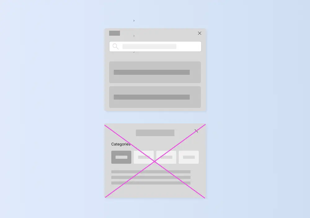
We explored two distinct approaches to improve information accessibility. The first design incorporated a search bar alongside clickable topic selections, offering users multiple pathways to find answers. The second iteration focused on a streamlined FAQ filter system, allowing users to quickly narrow down relevant information.
Iteration 2
Hi-Fi
We implemented the design featuring a search bar with clickable topics, as it proved more intuitive and aligned better with our vision for the help center. This approach offered users flexibility in finding information, catering to both those who prefer direct search and those who navigate by browsing categories.
Dimensions
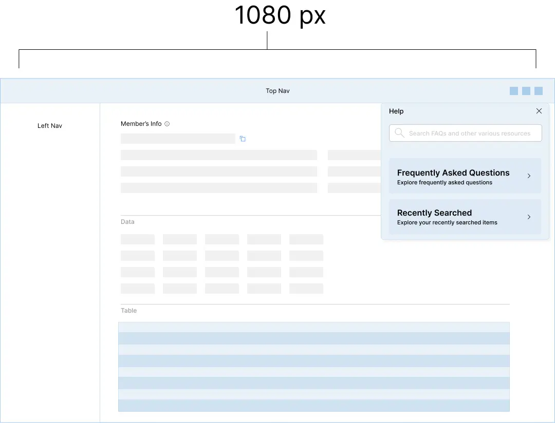
Screen Size
We design our screens with a minimum width of 1080 pixels, catering to the majority of modern devices, and considering that none of our team members use devices with screens smaller than 1080 pixels.
Iteration 3
First Deliverable
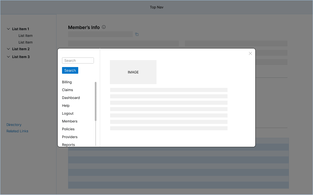
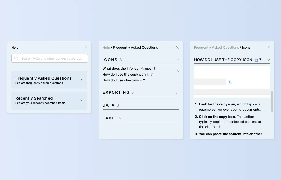
Users can easily access the FAQs by clicking on the "?" icon, which opens an FAQ overlay. This feature aims to provide quick answers to common questions, improving overall usability and user satisfaction.
Iteration 4
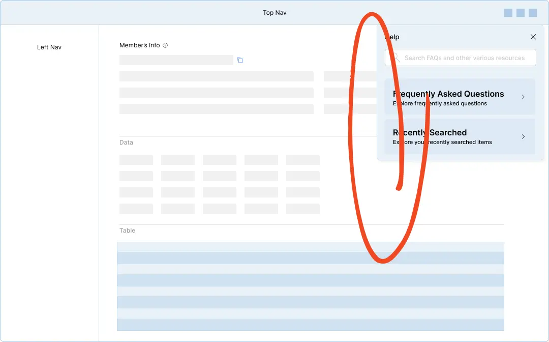
New PainPoints
While the new help center menu received praise, user tests uncovered an issue: it obstructed the view of vital material, prompting adjustments to preserve an unobstructed user experience.
Iteration 5
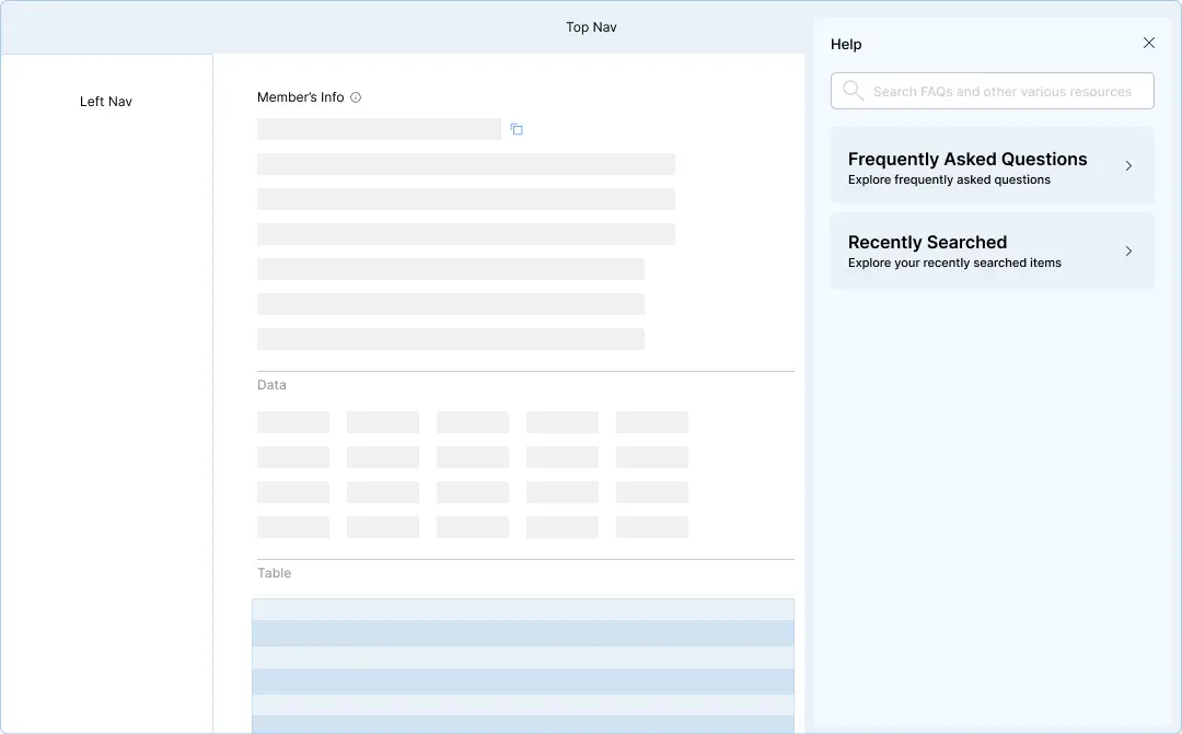
Drawer
To address the view obstruction issue, we implemented a strategic shift from an overlay to a sliding drawer for the help center. Additionally, we ensured the content remains responsive and adaptive to the drawer's sliding-out action, preserving visibility of crucial information on the main page while providing a user-friendly experience.
Learning from Experience,
Looking Ahead
We successfully delivered a well-received help center, earning stakeholder approval for its functionality and design. Future plans include expanding the FAQ, implementing AI, and adding new features. While some proposed enhancements are pending, we effectively integrated existing guides and screenshots to enhance the user experience.
